Brand & Style Guidelines
2025 Edition
Table of Contents
-
Brand Voice & Messaging
Our authentic tone, memorable examples & impact stories → -
Logo Guidelines
Proper usage of our brand marks → -
Brand Icons & Visual Elements
Our custom icon system and usage guidelines → -
Typography System
Poppins + Lora + Authenia pairing → -
Color Palette
Brand colors and accessibility guidelines → -
Social Media Guidelines
Platform-specific voice, examples & before/after templates → -
Implementation & Resources
Asset access and support contacts →
Brand Voice & Messaging
Humble Design welcomes people home, so that lives are changed for good.
Our brand voice reflects the strength, resilience, and triumph that defines the families we serve. We speak with honor and authenticity, celebrating the courage it takes to rebuild and the partnership we share in creating beautiful new beginnings.
Honorable
We recognize the strength and resilience of every family. Their journey to stability is an achievement we celebrate.
Memorable
We tell stories that stick, focusing on transformation, partnership, and the power of home.
Authentic
We speak plainly about real challenges and real victories, without sentimentality or pity.
✓ DO THIS: Honor Their Journey
✓ DO THIS: Honor Individual Journeys
✓ DO THIS: Domestic Violence Situations
✓ DO THIS: Celebrate Triumph
✓ DO THIS: Center Partnership
✗ NOT THIS: Diminishing Language
✗ NOT THIS: Families as Helpless
✗ NOT THIS: Vague Statements
✓ Say This
- "Families and individuals who have experienced homelessness"
- "Veterans transitioning to stable housing"
- "Partner with" / "Collaborate with"
- "Rebuilding" / "Creating stability"
- "Fresh start" / "New chapter"
- "Secured housing" / "Found home"
- "Emerging from homelessness"
- "Building their future"
- "Left an unsafe situation for safety"
- "Prioritized their family's wellbeing"
✗ Not This
- "The homeless" / "Homeless people"
- "Help" / "Give to"
- "Get back on their feet"
- "Less fortunate" / "In need"
- "Placed in housing" / "Given housing"
- "Suffering from homelessness"
- "Struggling families"
- "Fled domestic violence"
- "Escaped abuse"
Strength in Partnership
We don't rescue—we collaborate with resilient people creating their next chapter
Home as Foundation
A beautiful, functional space provides stability for everything that comes next
Community Power
Together, we create lasting transformation that ripples through generations
Dignity & Agency
Every family we serve has inherent worth and the power to shape their own future
✓ Say This
- "This mom brought her family through three shelters and never gave up. We simply helped her finish her story with a home she made her own."
- "After his military service, David secured an apartment and we partnered with him to make it feel like home."
- "When she prioritized her children's safety and left an unsafe situation, Maria showed incredible strength. Today, her kids have a safe space to call their own."
- "The bed is more than furniture. It's sleep, routine, school attendance, and renewed self-esteem."
- "Our volunteer crews don't just move furniture, they move futures. Individuals and families thrive when communities show up together."
- "Together, we're creating spaces where people can thrive."
- "Last year, we furnished 642 homes for individuals and families exiting homelessness."
- "Every home we design marks the beginning of a new chapter."
- "Because of our volunteers, every person we serve sleeps in a bed they can call their own."
✗ Not This
- "Without us, this family would still be lost."
- "We donate furniture so homes look nicer."
- "These families have struggled to make good choices, but we give them a fresh start."
- "She fled domestic violence and needed our help."
- "Humble Design provides services to underserved populations."
- "We improve lives through home design."
- "These families have suffered unimaginable hardship."
- "No other organization transforms lives through interior design like we do."
Remember:
Every individual and family we serve has already demonstrated incredible strength by securing housing. Our role is to partner with them as they create the next chapter of their story.
We honor their journey. We celebrate their resilience. We amplify their agency.
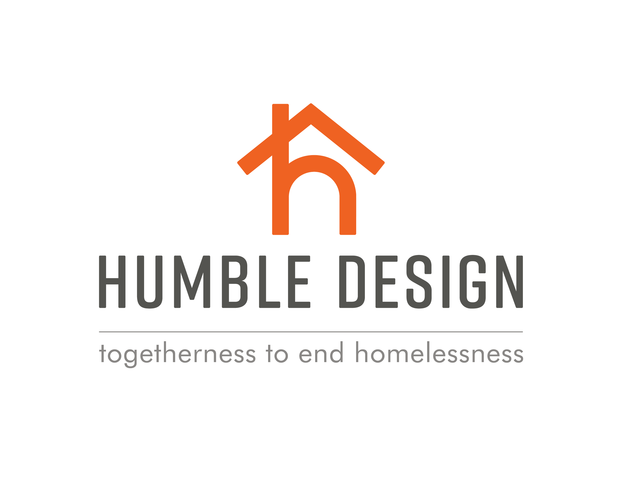
Logo Guidelines
Our logo is the cornerstone of our visual identity. The distinctive "h" with its roof represents home, shelter, and hope. It must always be used with care and respect, following the specifications outlined in this guide.
Vertical - Orange
Use for covers, posters, and square formats where vertical space is available.
Horizontal - Orange
Use for headers, business cards, and wide banner applications.
Vertical - Black
For single-color printing or when color reproduction is limited.
Horizontal - Black
For single-color applications and professional documents.
"h" Icon - Orange
Social media profiles, favicons, app icons when brand recognition is strong.
"h" Icon - Black
When color is not available or single-color printing is required.
"h" Icon - White
For dark backgrounds and high-contrast applications.
Use tagline version with "togetherness to end homelessness" for formal documents, letterhead, and when mission context is important.
Black tagline version for single-color printing and professional documents.
Orange tagline version for high-energy materials and brand emphasis.
Complete Logo Library Access:
All city-specific logo variations and additional brand assets are available in our shared Google Drive folder.
Includes all city variations, chapter logos, and additional brand assets
✓ Do
- Maintain minimum clear space equal to the height of the "h"
- Use approved color variations only
- Ensure logo is legible at all sizes
- Use high-resolution files for print
- Place on backgrounds with sufficient contrast
✗ Don't
- Stretch, skew, or distort the logo
- Change colors or add effects
- Place on busy or low-contrast backgrounds
- Use logos smaller than 0.5 inches in print
- Recreate or modify the logo elements
Brand Icons & Visual Elements
These custom icons create a humble, recognizable look without needing words. They represent the core elements of our work and can be used across all communications to reinforce our brand identity and mission.
When and How to Use Icons:
- Visual Communication: Use icons to create instant recognition without needing text
- Social Media: Icons work perfectly for Instagram stories, Facebook posts, and LinkedIn content
- Website Elements: Use for navigation, service descriptions, and call-to-action sections
- Print Materials: Include in brochures, flyers, and donation materials for visual interest
- Presentations: Replace bullet points with relevant icons for more engaging slides
- Email Campaigns: Use sparingly for section headers and key points
Download Complete Icon Set
Access high-resolution PNG files of all 12 brand icons for your projects.
Access Icon Library →Includes PNG files optimized for web and print use
Icon Color Usage:
- Primary: Humble Orange (#ED6221) for main usage and high visibility
- Neutral: Grey (#555551) for subtle applications and backgrounds
- Monochrome: Black for single-color printing or formal documents
- Reverse: White for dark backgrounds and high-contrast applications
- Brand Teal: Use sparingly for special emphasis
✓ Do
- Use icons consistently across all materials
- Maintain proper sizing and spacing
- Choose icons that relate to your content
- Use approved color variations only
- Ensure icons remain clear at small sizes
✗ Don't
- Modify, stretch, or distort the icons
- Add effects, shadows, or outlines
- Use icons from other sources mixed with ours
- Make icons smaller than 24px for digital use
- Use too many icons in one design
Typography System
Our three-font system creates perfect hierarchy and emotional resonance: Poppins for clarity, Lora for warmth, and Authenia for those special human moments that matter most.
Poppins (Sans-Serif)
Modern, clean, and highly readable. Perfect for body text, headers, and digital applications.
Lora (Serif)
Warm and approachable serif that adds personality to quotes and formal content.
Authenia (Script)
Beautiful script for emotional moments and special words that add humanity.
Typography Usage Guidelines:
- Headlines & Headers: Use Lora for major headlines and page titles to add warmth and personality
- Body Text & Navigation: Use Poppins for all body text, ensuring maximum readability
- Special Moments: Use Authenia for emotional words like "Before/After," "Helpers," "Heroes," "Happiness," "Welcome Home," "Thank You"
- Digital Applications: Poppins performs exceptionally well on screens and in web applications
- Print Materials: All three fonts work beautifully in print; choose based on the emotional tone desired
- Perfect Pairing: Lora headlines + Poppins body text + Authenia emotional accents
- Line Spacing: Maintain 1.5x line height for body text, 1.2x for headlines, 1.1x for script text
When to Use Authenia:
Template Labels:
- "Before" & "After"
- "Helpers"
- "Heroes"
- "Happiness"
Emotional Moments:
- "Welcome Home"
- "Thank You"
- "With Gratitude"
- "Hope"
Color Usage:
- Light backgrounds: Use Grey (#555551) for Authenia text
- Dark backgrounds: Use White (#FFFFFF) for Authenia text
- Avoid brand colors: Don't use orange or teal for script text - maintain contrast
- Test readability: Ensure sufficient contrast on all template backgrounds
Use sparingly for maximum impact. Authenia adds humanity and emphasis when Humble Design is being particularly approachable, friendly, and humble.
Font Access & Implementation:
- Poppins: Available free from Google Fonts (fonts.google.com/specimen/Poppins)
- Lora: Available free from Google Fonts (fonts.google.com/specimen/Lora)
- Authenia Textured: Purchased and licensed for Humble Design use. Available in Canva Brand Kit.
- Canva Access: All three fonts are available in the Canva Brand Section along with brand colors, templates, and assets
- Web use: Poppins and Lora can be embedded via Google Fonts API
- Desktop use: Download and install locally for design software
- Fallbacks: System fonts like Arial (sans-serif), Georgia (serif), and Brush Script (script) as backups
Color Palette
RGB: 0, 171, 184
CMYK: 73, 0, 24, 0
RGB: 237, 98, 33
CMYK: 0, 65, 90, 0
RGB: 17, 55, 62
CMYK: 85, 50, 45, 45
RGB: 0, 92, 99
CMYK: 85, 35, 40, 25
RGB: 218, 232, 234
CMYK: 12, 2, 6, 0
RGB: 255, 218, 200
CMYK: 0, 15, 22, 0
RGB: 85, 85, 81
CMYK: 55, 48, 51, 43
RGB: 255, 255, 255
CMYK: 0, 0, 0, 0
Primary Color Applications:
- Humble Teal: Primary brand color for logos, headers, and key messaging
- Humble Orange: Accent color for calls-to-action, highlights, and energy
- Deep Teal: Body text, professional documents, formal communications
- Grey: Text, secondary content, and professional applications
- White: Backgrounds, headlines, and text on dark backgrounds
All color combinations meet WCAG 2.1 AA standards for accessibility.
Color Best Practices:
- Maintain 4.5:1 contrast ratio for normal text, 3:1 for large text (18pt+)
- Never rely solely on color to convey important information
- Use no more than 3 colors from our palette in a single design
- Orange should be used sparingly as an accent color for maximum impact
- Test designs with colorblind simulation tools
- Consider users with visual impairments when choosing combinations
Implementation & Resources
Available Assets:
- Logo Files: SVG, PNG, and PDF versions in all approved color variations
- Brand Icons: Complete set of 12 custom icons in PNG format
- Color Palettes: Adobe Swatch Exchange (.ASE) files for design software
- Typography: Font files and web embedding codes
- Templates: Canva templates for social media before/after content
- Brand Photography: High-resolution images following brand guidelines
- Email Signatures: HTML templates with proper logo and contact formatting
File Format Guidelines:
- Print: Use vector formats (SVG, AI, EPS) or high-resolution PNG/PDF (300 DPI minimum)
- Web/Digital: Use SVG for scalability or optimized PNG files
- Social Media: Use provided templates with correct dimensions for each platform
- Email: Use HTML templates or PNG files at appropriate sizes
Complete Brand Kit in Canva:
Access all brand fonts, colors, and templates directly in Canva's Brand Section. No need to download fonts to your computer—everything is ready to use.
Available in Canva Brand Kit:
- Fonts: Poppins, Lora, and Authenia Textured
- Colors: Complete brand palette with hex codes
- Templates: Business cards, presentations, social media posts
- Before/After Templates: Ready-to-use transformation layouts
Brand Implementation Support:
General Inquiries: hello@humbledesign.org
National Communications Manager: Available for brand consultation and approval
Web Resources: humbledesign.org for current brand examples
For questions about implementing these guidelines or requesting brand assets, reach out to our team. We're here to help ensure your materials represent Humble Design with authenticity and professionalism.
Brand Asset Access:
- Contact hello@humbledesign.org for access to high-resolution logo files
- Request vector formats (SVG, AI, EPS) for scalability
- Use 300 DPI minimum for print projects
- Obtain brand photography from the marketing team
- Social media templates available in Canva Brand Kit
Ready to Create?
Use these guidelines to maintain our authentic, professional brand while creating materials that truly represent the heart of Humble Design.
Questions about brand implementation?
Contact: hello@humbledesign.org
© 2025 Humble Design. Brand guidelines aligned with humbledesign.org
Social Media Guidelines
LinkedIn
Tone: Professional impact stories, partnership announcements
Voice: Professional yet personal, mission-driven
Example: "The team at Aon knocked it out of the park today with their Day of Service (or as we call it—a Day of Joy)..."
Facebook
Tone: Community updates, volunteer spotlights, longer stories
Voice: Conversational, inclusive, family-oriented
Example: "Last Wednesday we served an incredible veteran who has endured more than most..."
Instagram
Tone: Visual storytelling, behind-the-scenes, transformations
Voice: Warm, inspiring, community-focused
Hashtags: #FurnishingHope #HumbleDesign #HomeIsWhereTheHeartIs
Email Marketing
Tone: Personal updates, gratitude, calls-to-action
Voice: Direct, heartfelt, action-oriented
Example: "Be a Humble Hero" campaign messaging
✓ Strong Social Media Post
⚠ Needs More Impact
Transform your storytelling with our professionally designed before and after templates. The color progression from pale to vibrant perfectly represents our mission of transformation.
Orange "Before" Template
Color: Light Orange (#FFDAC8)
Use for: Empty spaces, initial conditions, pre-transformation states
Gentle warmth suggesting potential
Orange "After" Template
Color: Humble Orange (#ED6221)
Use for: High-energy reveals, celebration moments, call-to-action content
Dynamic energy and transformation complete
Teal "Before" Template
Color: Light Teal (#DAE8EA)
Use for: Empty spaces, initial conditions, pre-transformation states
Represents hope and potential in its gentle form
Teal "After" Template
Color: Humble Teal (#00ABB8)
Use for: Completed transformations, furnished homes, success stories
Shows the vibrant result of our work
Before & After Template Best Practices:
Access Your Templates & Brand Kit
Ready-to-use Canva templates with proper branding, fonts, and color combinations. Find everything in the Brand Section.
Access Canva Brand Kit →Includes fonts, colors, templates for business cards, presentations, and social media posts
Writing for Social Media:
Visual Content Best Practices: